Slow down with 10 free printable mindfulness coloring pages made for grown-ups: a rainy-day window seat with a sleeping cat, a quiet koi pond, tea in a rose garden, and gentle affirmation pages like “I am enough” and “Breathe.” Some research suggests coloring can help people feel calmer, and many people enjoy it as a quiet way to unwind at the end of the day. The set mixes detailed scenes with simple, flowing designs, and every page prints from its own Download and Print buttons.
About Mindfulness Coloring
Mindfulness coloring is simply coloring with your full attention switched on: noticing the color spreading under the pencil, the feel of the page, and the pattern slowly filling in. Adult coloring books became a phenomenon for exactly that reason — the pages ask for nothing except that you sit down and be where you are for a while. Many people find it a calm, pleasant way to unwind at the end of the day, somewhere between a puzzle and a daydream. There are no scores, no levels, and no way to do it wrong, which is rather the point.
Getting started takes almost nothing: a page you like the look of, pencils or fine markers, and a chair you enjoy sitting in. Colored pencils forgive and layer well, which suits detailed pages; markers give bold, even color but can bleed through thin paper, so a spare sheet underneath is wise. People develop rituals — the same mug of tea, the same playlist, one page finished before starting another — or none at all. The only real equipment is a little unhurried time, and the finished page, which many colorists end up framing, giving away, or keeping in a folder of quiet victories.
Get new coloring pages sent to your inbox!
Sign up and get our free 10-page Printable Favorites pack.
All 10 Mindfulness Coloring Pages
Scroll down to browse every page below, or use the Print button under any image to print just that page.
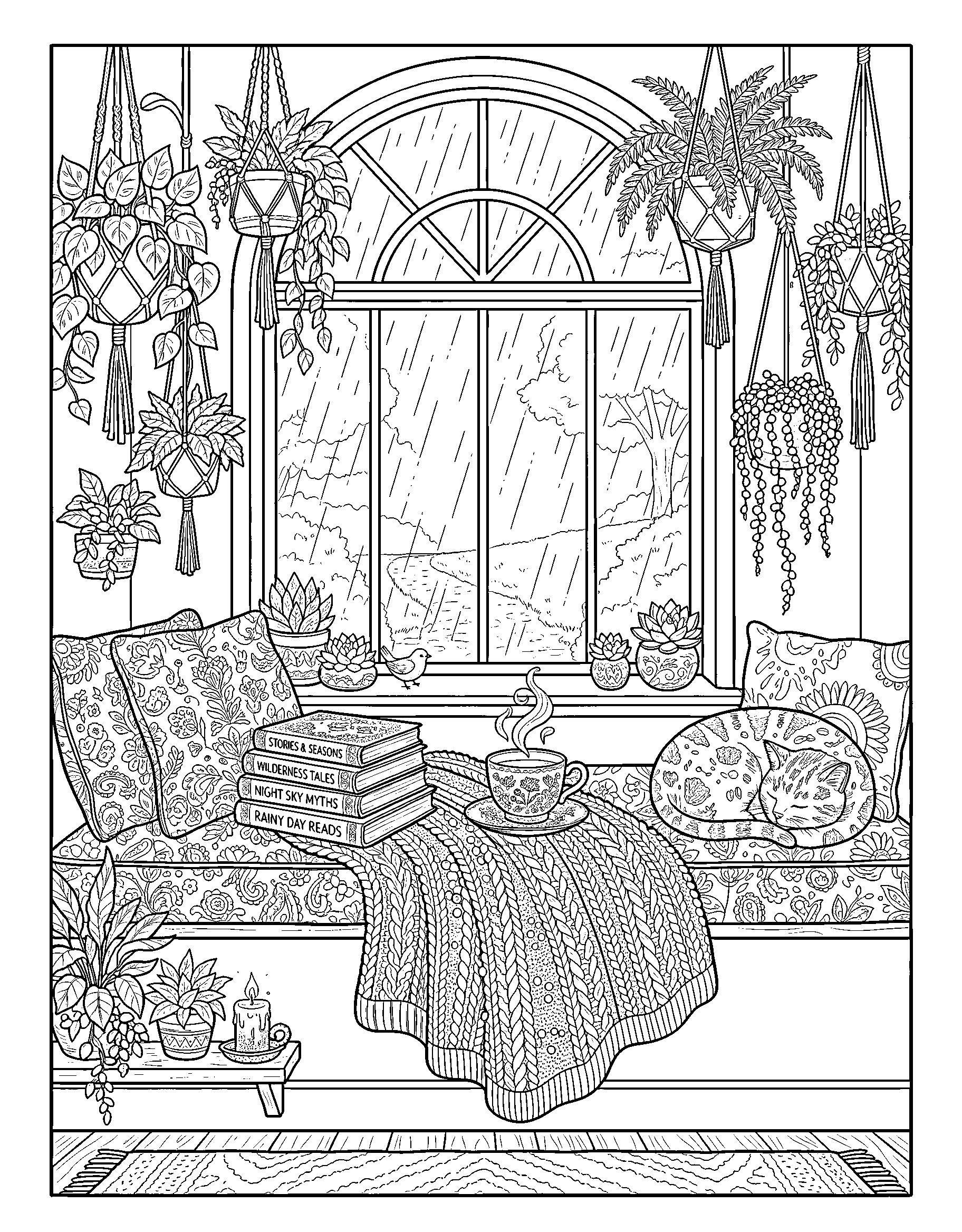
A rainy-day window seat piled with patterned cushions, a stack of books, a steaming cup of tea, and a cat asleep on the knit blanket. Detailed — best for teens and adults.
Play warm against cool: inside the window, cushions, books, and the knit blanket glow in amber, rust, and warm cream, while the rain beyond the glass runs blue-gray and silver. The sleeping cat can anchor everything in ginger or soft gray. The tea's steam stays white — a pale island that tells you which side of the glass is cozy.
Patterned cushions reward a system: assign each cushion one small palette of three colors and repeat those three across its pattern, and the pile looks designed instead of busy. The knit blanket works beautifully row by row — alternate two shades along the knit rows, and the texture the artist drew will do the rest.
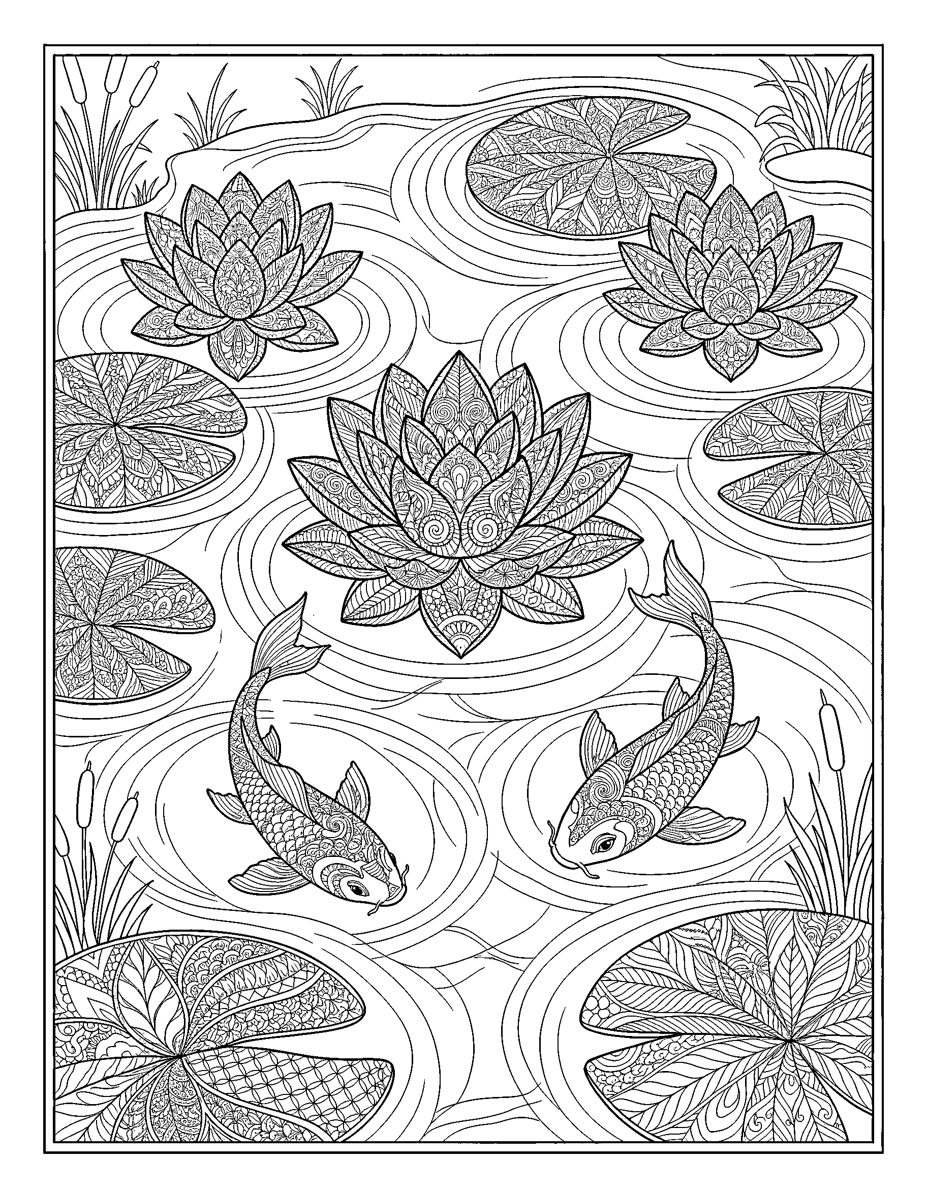
Two koi drift between patterned lotus flowers and lily pads in a still pond, every petal filled with tiny swirls. Detailed — best for teens and adults.
Real koi are living jewels: white with red patches, solid gold, orange, and inky black are all classic patterns, so make each fish a different combination. Lotus flowers grade from deep pink at the petal base to almost white at the tips, and lily pads run emerald to yellow-green. Keep the water a quiet blue-green so the fish carry the color story.
Every petal in this pond is filled with tiny swirls, and the calm way through them is one petal at a time, one swirl family at a time — light shade in the swirl, deeper in the groove beside it. Leave a few thin white curves on the water around the fish: they read as ripples and make the pond feel still, not flat.
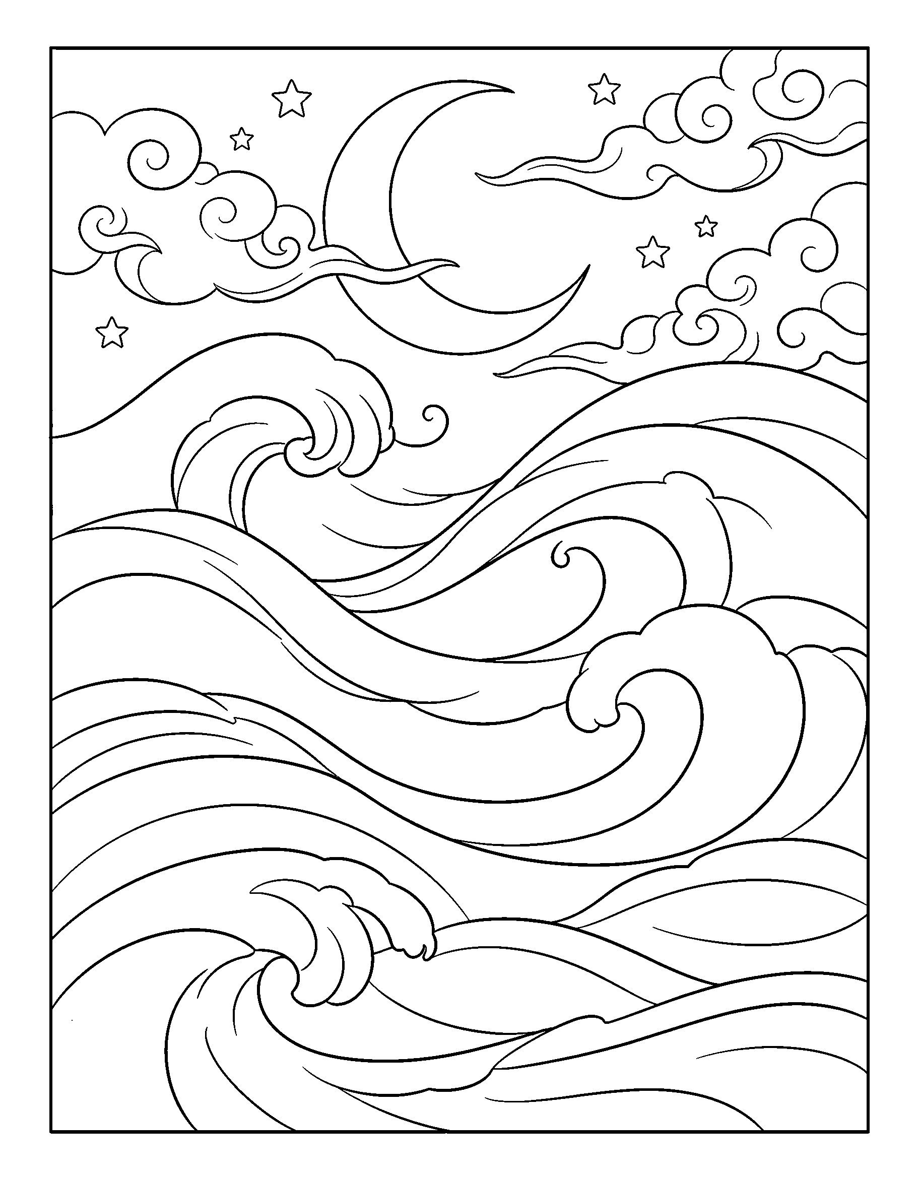
Rolling waves curl under a crescent moon and swirly clouds, drawn in big, flowing lines with lots of open space. Easy — simple lines, quick to finish.
A night palette with training wheels: the crescent moon goes warm gold, the swirly clouds take lavender and the palest gray, and the rolling waves stack up in blues — deepest at the bottom of the page, lighter as they climb toward the moon. Big open shapes mean you can finish the whole sky-to-sea gradient in one relaxed sitting.
Each wave curl is a band, so give every band its own shade and the sea gains rhythm — like stripes in a blanket. If the sky feels empty when you're done, you can draw in a scattering of small stars around the moon; this open, flowing page was practically designed to accept a few additions of your own.
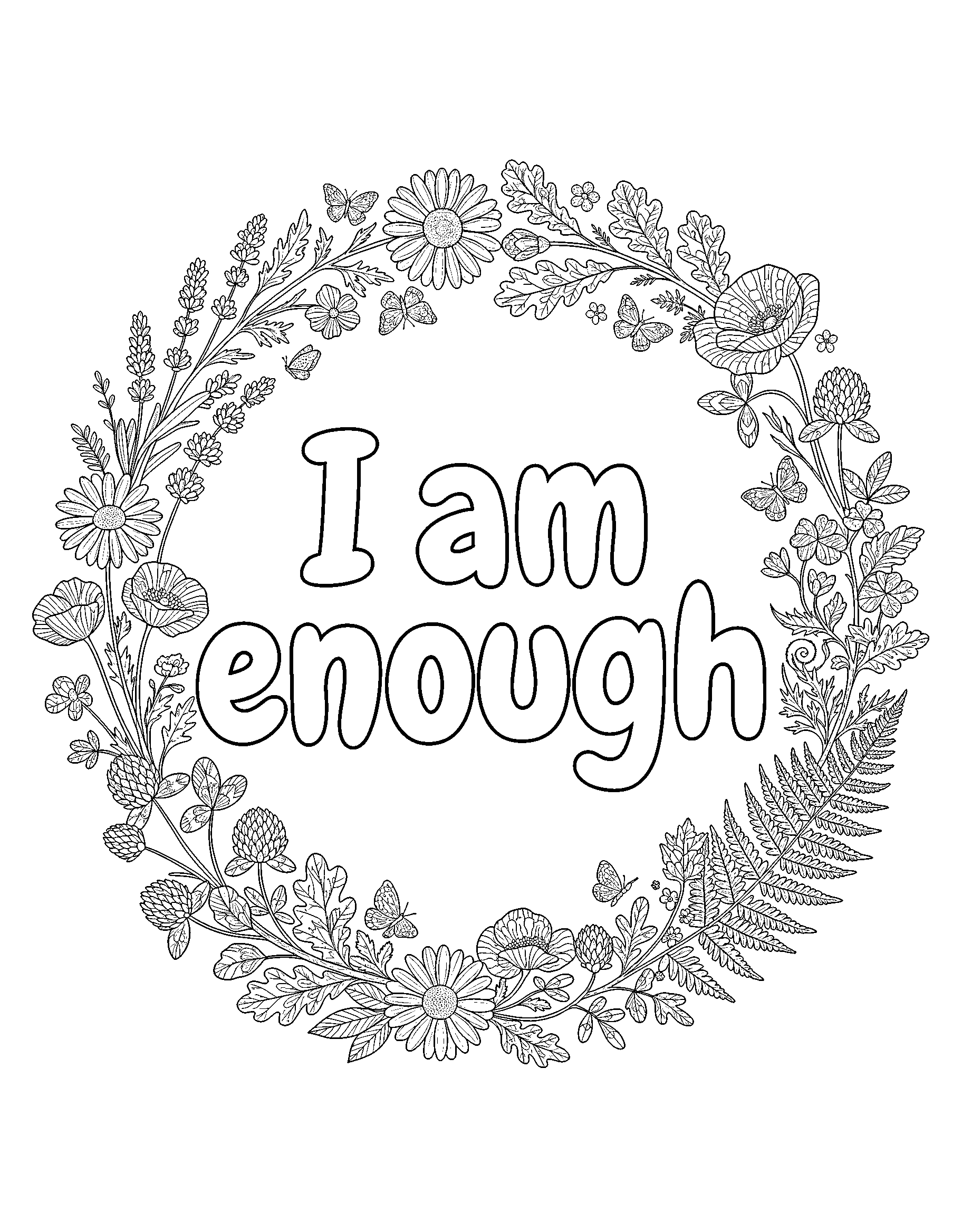
The words “I am enough” sit inside a wreath of daisies, poppies, lavender, and ferns, with little butterflies tucked between the leaves. Detailed — best for teens and adults.
The wreath is a flower shop in miniature, so color by species: daisies white with gold hearts, poppies in red and orange, lavender in true purple spikes, and ferns in two fresh greens. The lettering deserves one strong, steady color — deep teal or plum — applied last, so the words sit proudly on top of the garden around them.
Little butterflies hide between the leaves, and they're your accent color: pick one bright note — coral, turquoise, gold — that appears nowhere else, and use it only on the butterflies, so the eye keeps discovering them. A metallic gel pen over the finished lettering is a lovely final touch if this page is destined for a frame or a friend's mailbox.
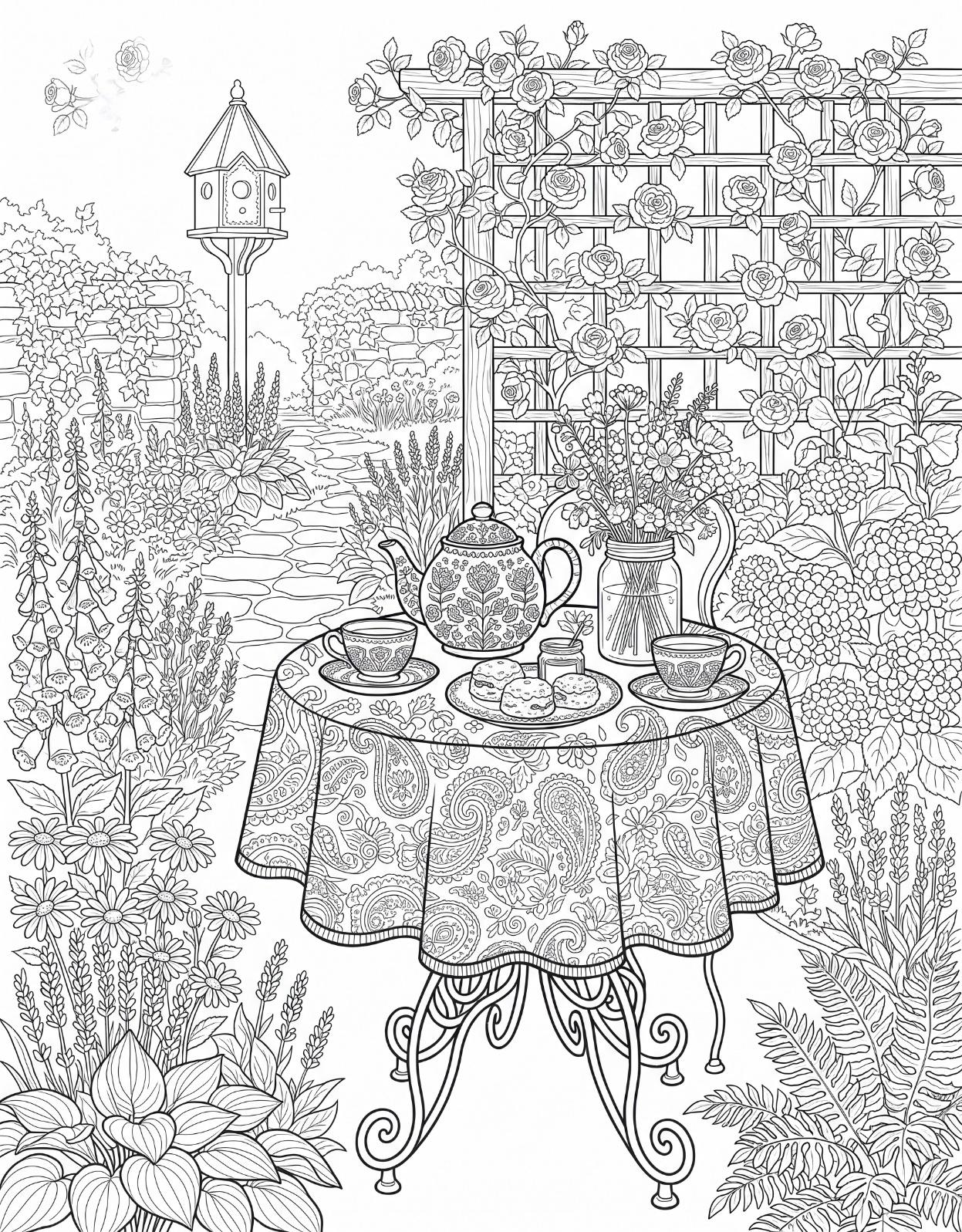
A garden table set for tea — teapot, scones, and a jar of fresh flowers — under a trellis of climbing roses, with a birdhouse down the path. Detailed — best for teens and adults.
Climbing roses set the palette: crimson, blush, and cream blooms against deep green leaves, with the trellis in weathered wood brown. Below, the tea table goes porcelain — a white or pale-blue teapot, scones in golden baked tones, and the jar of fresh flowers echoing the roses in miniature. The birdhouse down the path can steal one bright color for charm.
A garden path is a perspective trick: color its nearest stones largest and lightest, and let them shrink in saturation as they retreat toward the birdhouse, and the little scene gains a whole backyard of depth. Fine tips earn their keep on the scones and teacups — tiny shapes, patiently filled, are what make detailed pages feel jewel-like at the end.
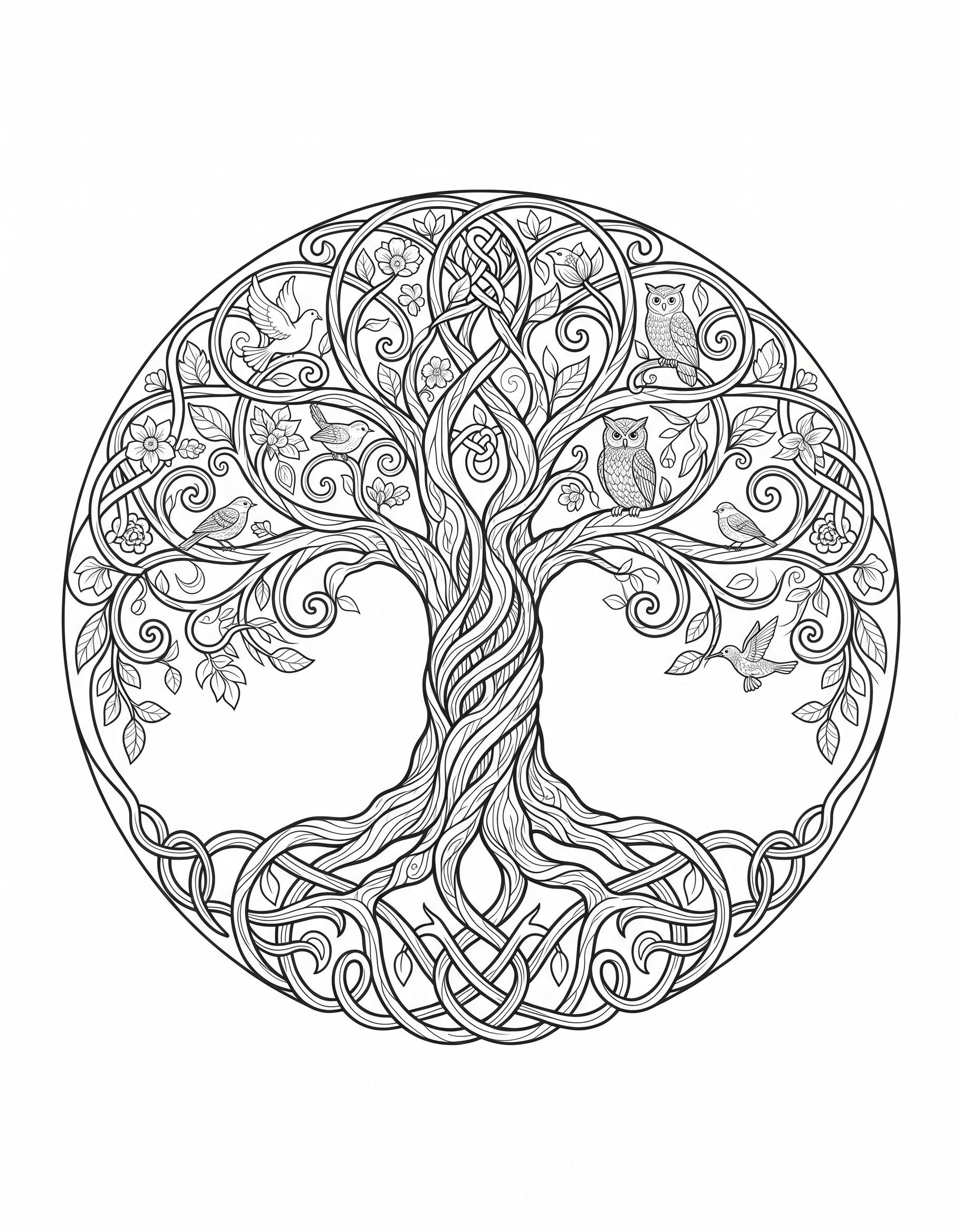
A tree of life in a Celtic-style circle, its swirling branches home to owls, songbirds, a dove, and a hummingbird. Medium — a gentle step up in detail.
A tree invites a season, so choose one and dress it: spring in fresh greens with blossom pink, summer in deep emerald, or autumn in gold, rust, and scarlet with the bark in warm gray-brown. The birds each take their real-world colors — owls in barred browns and cream, the dove in soft white-gray, the hummingbird in emerald with a ruby throat.
The Celtic-style circle framing the tree is a pattern, so treat it like one: pick two or three colors and repeat them in strict rotation around the ring, and the border will look woven. Inside, let the swirling branches echo that rhythm by shading each branch the same way — dark beneath, light on top — wherever it curls.
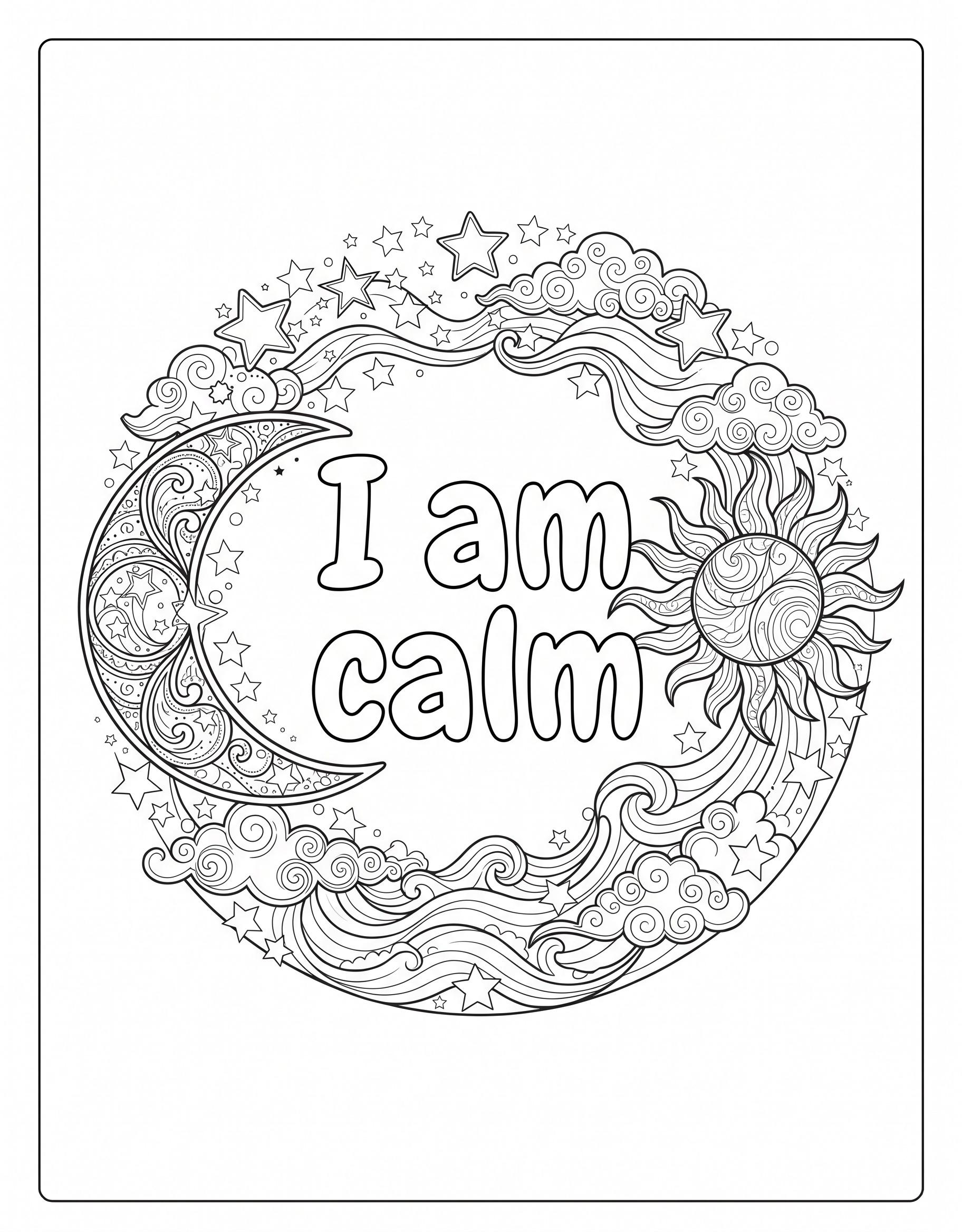
A patterned crescent moon and a smiling sun circle the words “I am calm,” surrounded by stars and curling clouds. Medium — a gentle step up in detail.
This page is a meeting of night and day, so split the palette down the middle: the patterned crescent moon in silver-grays, golds, and dusty blue, and the smiling sun in warm yellows and soft orange. Stars take the moon's gold, curling clouds take dawn colors — peach and lavender — and the lettering in deep navy holds the two halves together.
Patterned moons reward section work: finish one patterned section completely before moving to the next, alternating light and dark sections so the crescent reads as a whole when you step back. If you like a finishing sparkle, a silver or gold gel pen dotted onto the stars at the very end makes the night half twinkle against the day.
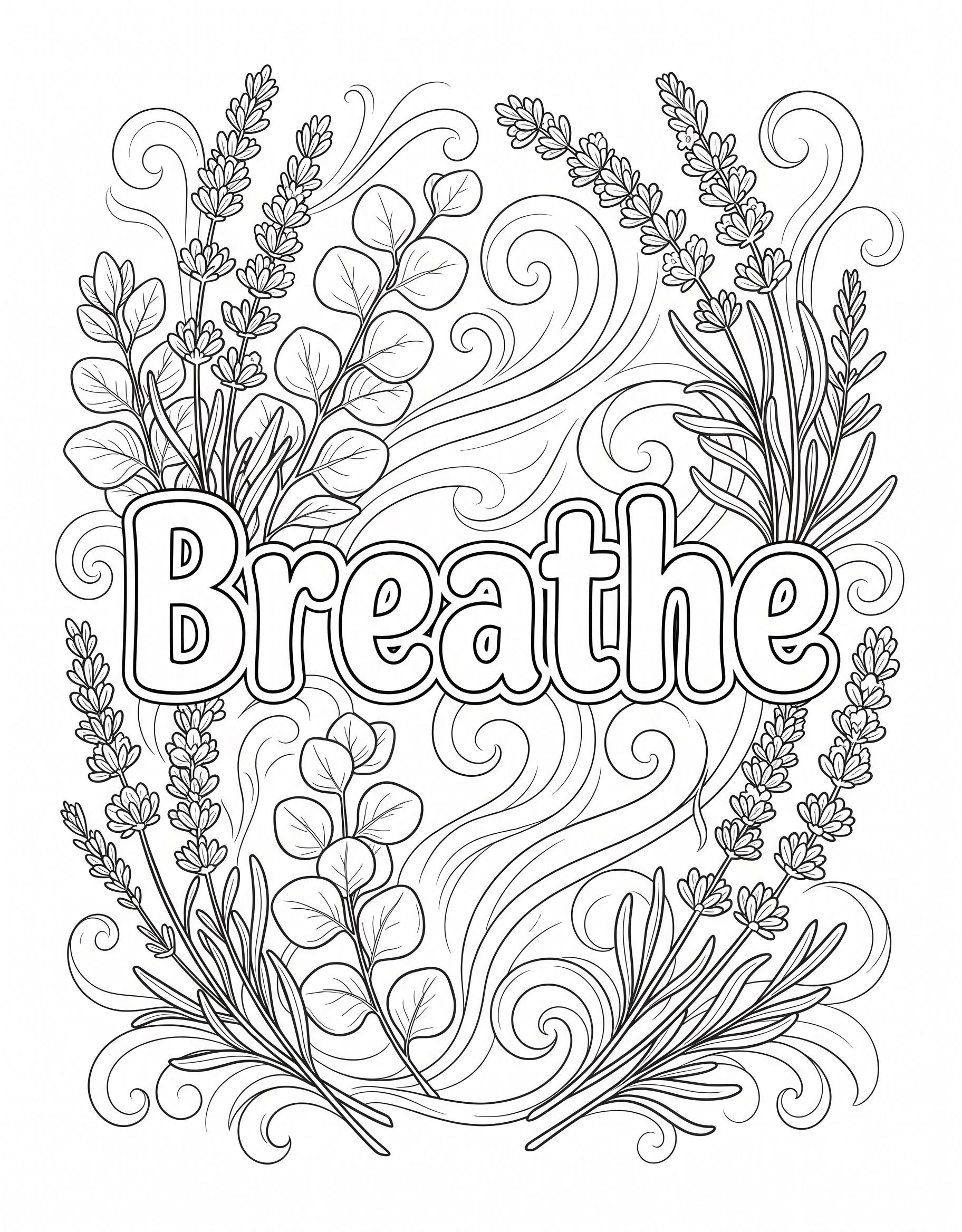
Lavender sprigs and eucalyptus leaves frame the word “Breathe,” with soft wind swirls drifting through the page. Medium — a gentle step up in detail.
Two plants, two color families, one quiet page: lavender in layers of purple — deep buds at each spike's tip, paler below — and eucalyptus in its true blue-green-gray, round leaves alternating light and dark along the stem. The soft wind swirls should barely be there: the palest blue-gray you own, so the word Breathe floats in clean air.
Lavender buds are dozens of tiny ovals, and the pleasant way to color them is loosely — a dab of color per bud rather than a perfect fill, letting the cluster build up like the real flower head. Keep your pressure light on the swirls and leaves alike; this is the page in the set that looks best when nothing on it shouts.
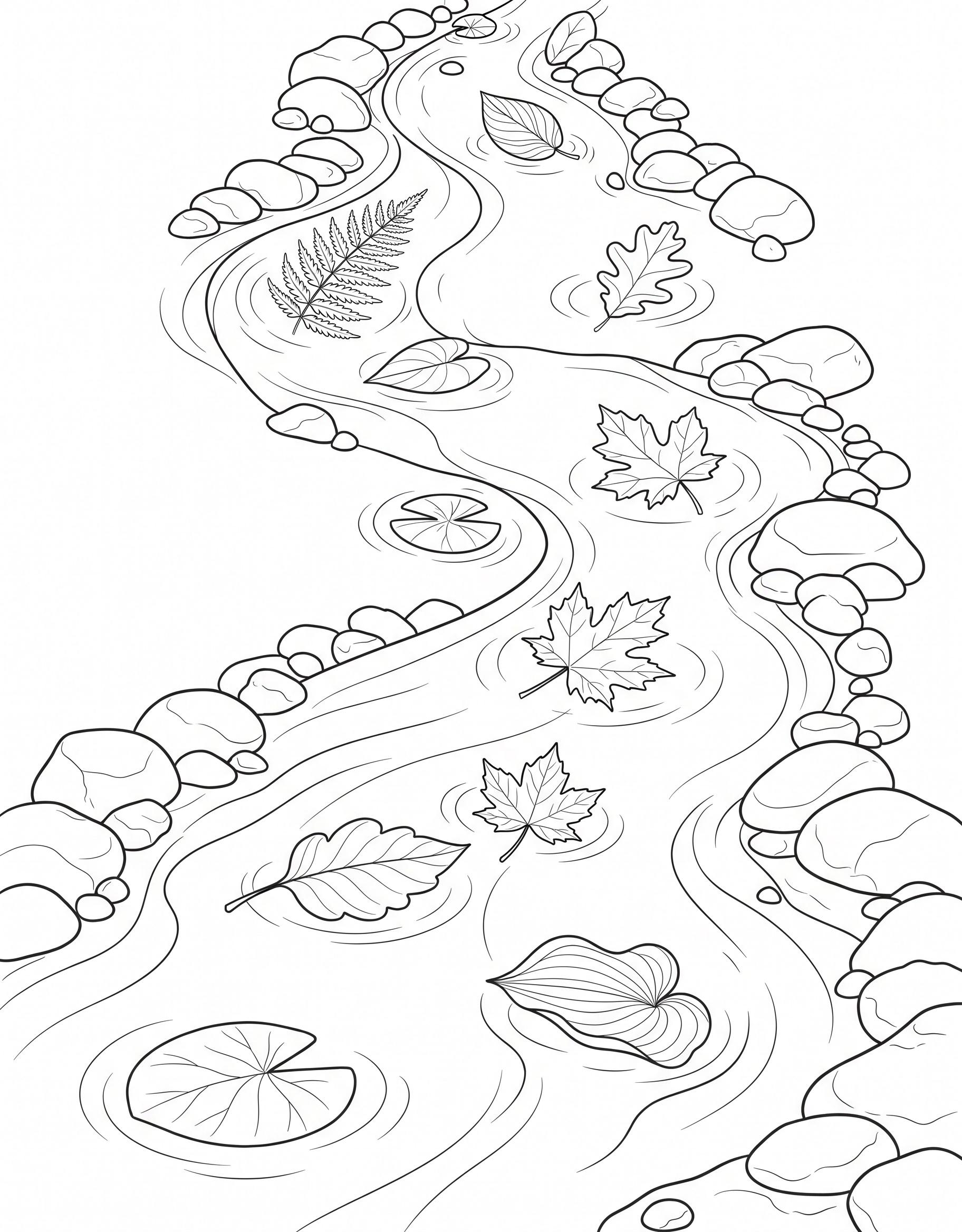
Maple, oak, and fern leaves float down a winding stream past smooth river rocks, drawn in clean, simple lines. Easy — simple lines, quick to finish.
Each leaf can wear its own autumn: the maple in red or orange, the oak in gold or russet brown, the fern staying green, the way a real stream mixes fresh and fallen leaves. Smooth river rocks take friendly grays — one dark, one light — and the water itself the palest blue, left white in a few streaks to suggest it moving.
Simple lines, quick finish — the pleasure here is in the order: color the leaves first while your hand is fresh, then the rocks, then wash the water around everything in long strokes that follow the stream's winding direction. Following the current with your pencil makes the whole page feel like it's flowing downhill, even before it's finished.
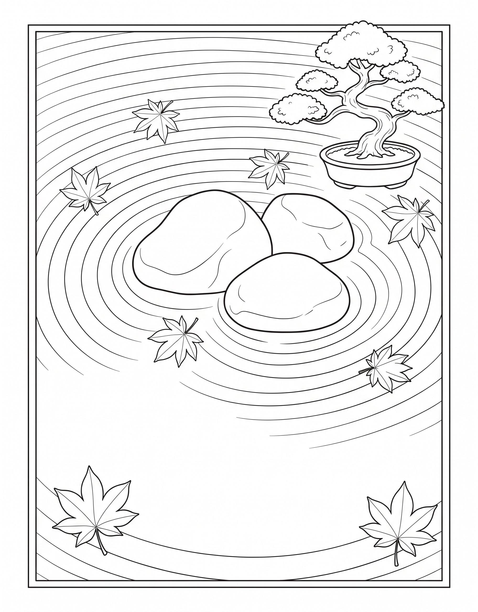
Three smooth stones rest in a raked-sand zen garden beside a little bonsai tree, with maple leaves scattered around the ripples. Easy — simple lines, quick to finish.
Restraint is the palette: the raked sand stays warm cream and barely-there tan, the three smooth stones take three deliberate grays, and the bonsai carries the page's only strong colors — deep green foliage pads over a warm brown trunk. Scattered maple leaves are the accent, in red and gold, placed like exclamation points in a quiet sentence.
The raked ripples around the stones are the soul of a zen garden, so trace them with a light gray or tan pencil rather than filling the sand solid — the pattern is the picture. Keep most of the sand empty on purpose. If you finish and it feels too plain, that's the style working; add nothing except, perhaps, your name in a corner.
Coloring Tips for Mindful Coloring
- Rainy window seat: warm cream and mustard for the cushions, sage-green plants, and a soft gray-blue outside the window so the inside feels extra cozy.
- Koi pond: classic orange-and-white koi, pink lotus flowers, and deep teal water — leave a few ripples white for sparkle.
- Moon and waves: stay inside one color family (all blues, or purples fading into pink) for a calm ombré sky and sea.
- Affirmation pages: color the words in one bold shade and keep the wreath or sky around them softer, so the message stands out — these are nice pages to frame when finished.
- Zen garden and quiet stream: a small palette of three or four muted colors (stone gray, leaf green, sand) suits these quiet scenes best.
FAQ
How do I print these pages?
Open the page you like and use its Print button, or download the image and print it from your device. US Letter (8.5x11) works best; A4 is fine with fit-to-page enabled.
What should I color them with?
Colored pencils and gel pens suit the detailed pages, and the simple flowing designs also work well with markers. For markers, print on heavier paper and slip a scrap sheet behind the page.
What if I go outside the lines or make a mistake on a detailed page?
It matters far less than it feels like it does. A stray mark can be softened with a colorless blender pencil, covered by deepening the neighboring color, or simply left — hand-colored pages are supposed to look hand-colored. Many colorists find the small imperfections become invisible the moment the whole page is finished and seen at arm's length.
More Coloring Pages You'll Love
If you enjoyed these, try our Mandala Coloring Pages, Cat Coloring Pages, or Color Your Way to Peace and Serenity next.
Coloring is a relaxing hobby, not a substitute for professional care. If you're struggling, please reach out to a doctor or counselor.
Reviewed by Lara Bennett — every coloring page in this post was checked for clean lines, clear difficulty, and print quality before publishing.